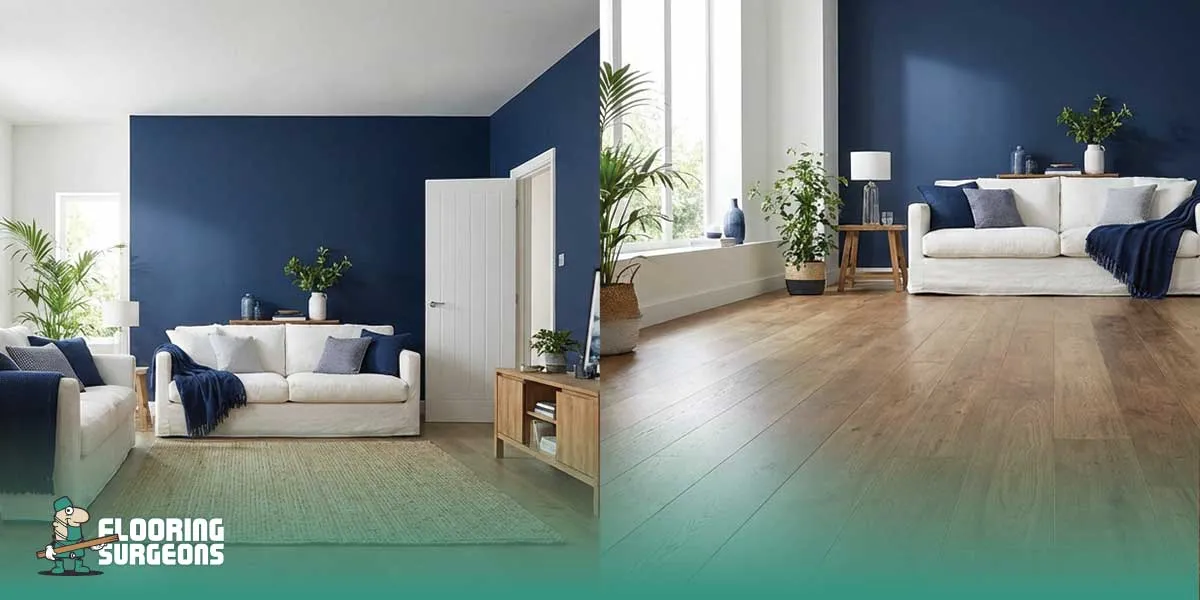
Bold indigo is emerging as a defining colour trend in 2026, paired with calming white interiors to create contrast that feels both dramatic and balanced. This indigo and white palette works best when flooring is considered as part of the system, since wood tone, finish, and reflectivity directly influence how bold walls and soft whites feel in real spaces.
Table of contents
Why Bold Indigo Is Dominating Interior Colour Trends in 2026
Bold indigo has become a defining statement colour trend in 2026 because it delivers depth without feeling chaotic. Unlike brighter blues, indigo carries a grounded richness that feels intentional and architectural. Designers are increasingly choosing deep blue walls to create focal points that anchor a room rather than simply decorate it. Indigo is a deep blue tone positioned between navy and violet, known for absorbing light rather than reflecting it, which is why it creates depth without harsh brightness.
In modern interiors, indigo works as a controlled, bold move. It pairs well with clean lines, minimal styling, and layered neutrals, allowing spaces to feel contemporary without relying on overly experimental palettes. This balance between drama and restraint is one reason the indigo colour trend in 2026 feels mature rather than seasonal.
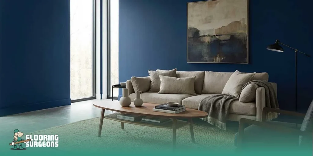
There is also a psychological component behind its rise. As homeowners seek calmer, more immersive spaces, indigo delivers the depth associated with mood-enhancing colours while still maintaining sophistication. It feels confident, stable, and adaptable, making it suitable for living rooms, bedrooms, and even open-plan areas seeking visual identity.
The Psychology Behind Indigo in Interior Design
The rise of indigo is not only about aesthetics; it is rooted in colour psychology in interior design. As homeowners move toward more immersive and emotionally responsive spaces, bold colour interiors are being chosen with greater intention. Indigo stands out because it offers both visual depth and psychological stability, making it powerful without feeling chaotic.
Indigo and Emotional Depth
In colour psychology in interior design, indigo is associated with focus, introspection, and emotional grounding. Unlike brighter blues that stimulate energy, indigo absorbs light in a way that creates intimacy and calm. This is why many bold colour interiors use indigo to establish atmosphere rather than excitement. It encourages stillness and makes rooms feel layered and considered rather than loud. Because indigo sits between blue and violet on the spectrum, it introduces subtle complexity. That layered tonal quality gives walls dimension and allows the colour to feel architectural rather than decorative.
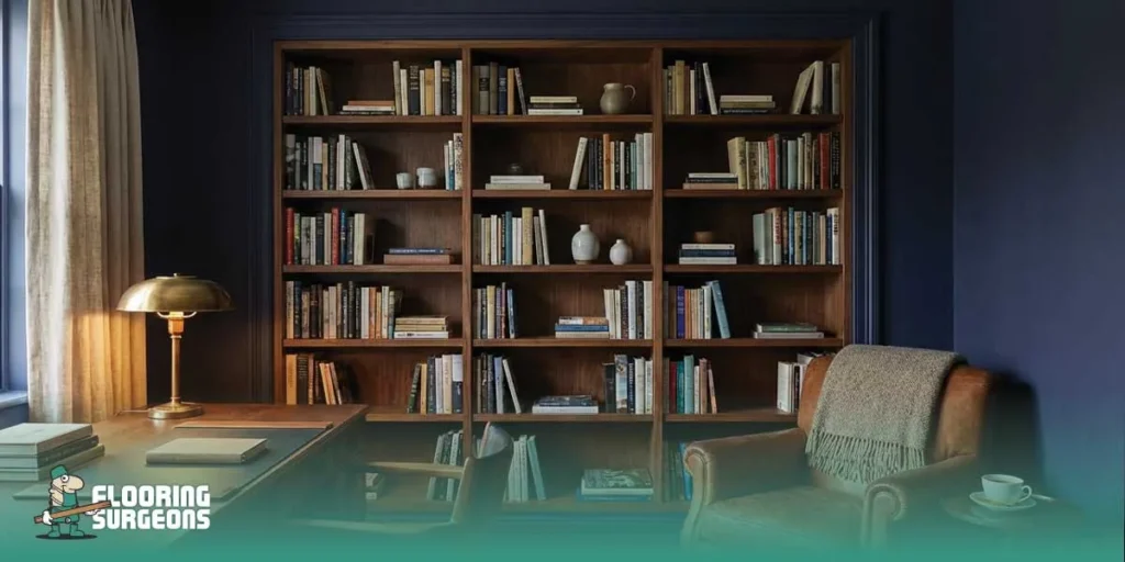
Why Dark Blue Feels Sophisticated Rather Than Overwhelming
Dark blue tones feel sophisticated because they create contrast without harshness. Deep blue walls frame a space instead of dominating it, especially when paired with balanced neutrals. In modern interiors, indigo reads as structured and confident rather than impulsive. The difference between refined and overwhelming often comes down to proportion and contrast control. Indigo maintains elegance because it softens light instead of amplifying it, which helps bold colour interiors feel intentional and composed rather than visually heavy.
Calming Whites Are Evolving Beyond Minimalism
Calming white interiors are no longer limited to stark minimalism. In current white paint trends, designers are moving toward layered, softer tones that feel warm and intentional rather than clinical. Modern white shades are being selected not just for brightness, but for how they interact with light, materials, and surrounding colours like indigo. In interior design terms, calming whites refer to soft, low-contrast white paint shades with subtle warm or neutral undertones rather than stark architectural white.
Instead of treating white as a default background, it is now part of a calming neutral palette that shapes the mood of a room. The undertone of white can dramatically influence whether a space feels inviting or sterile, especially when paired with bold walls or strong contrasts. Key distinctions that matter in practice:
- Warm white vs cool white: Warm whites soften contrast and pair better with deep blue walls, while cool whites can intensify high contrast interiors.
- Soft white vs pure white: Soft whites reduce glare and feel more layered, whereas pure white can appear sharp and clinical in certain lighting conditions.
- White in north-facing rooms: Cooler natural light can make whites appear grey or flat, so slightly warmer modern white shades often maintain balance and prevent the space from feeling cold.
Understanding these differences ensures that calming white interiors feel deliberate and harmonious rather than simply minimal.
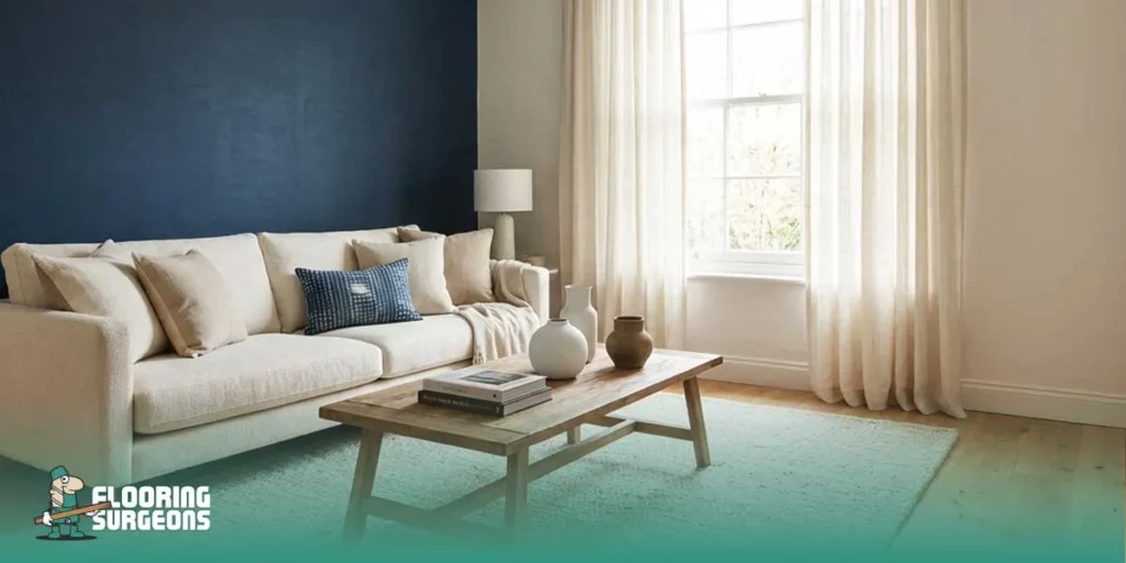
Indigo and White Together — Managing Contrast Without Overpowering a Room
Indigo and white create striking high contrast interiors, but the success of this pairing depends on careful contrast control. Without balance, the space can feel sharp or compressed. When managed correctly, however, this indigo and white colour palette enhances room perception and creates strong visual balance. The key is understanding that flooring plays a structural role in how this contrast is experienced. If you want a deeper explanation of why floor tone changes how contrast feels, see our guide on the psychology of dark vs light flooring.
How to Balance Indigo and White Without Overloading the Space
| Element | Best Practice | Flooring Consideration | Mistake to Avoid |
| Wall tone | Use indigo on a feature wall or balanced across evenly lit surfaces | Pair with lighter or mid-tone flooring to prevent visual heaviness at the base of the room | Dark indigo combined with very dark flooring in small rooms |
| White shade | Choose soft or slightly warm modern white shades to reduce harsh contrast | Ensure flooring undertones complement the white to maintain visual balance | Pure cool white with cool-toned floors creating a sterile contrast |
| Floor tone | Select light oak, natural wood, or balanced neutrals under bold walls | Flooring anchors the contrast and influences room perception more than wall colour alone | Ignoring floor tone when choosing paint leads to an imbalance |
| Ceiling colour | Keep ceilings lighter than walls to maintain vertical openness | A lighter ceiling works best when the flooring is not overly dark, preventing vertical compression | Matching the ceiling too closely to the indigo, making the room feel lower |
| Natural light | Assess how daylight shifts the intensity of indigo and white throughout the day | Reflective or satin finishes on flooring can subtly improve light distribution and soften high-contrast interiors | Matte dark flooring in low-light rooms intensifies shadow and reduces visual balance |
When indigo and white are treated as part of a complete system rather than isolated paint choices, contrast feels intentional instead of overwhelming. Flooring tone, finish, and reflectivity quietly determine whether the palette reads dramatic and refined or heavy and confined.
Do Bold Indigo Walls Make a Room Feel Smaller?
Bold indigo walls can make a room feel smaller if contrast, lighting, and flooring tone are not balanced correctly. Dark walls absorb more light, which may create visual compression in compact spaces. However, when paired with appropriate flooring and controlled contrast, indigo can feel architectural rather than shrinking.
The perception of dark walls is closely linked to how the eye reads depth and boundaries. Deep blue surfaces naturally pull visual weight toward them, and in small rooms, this can intensify the sense of enclosure. This is where flooring tone becomes critical. Light or mid-tone flooring reduces visual compression by lifting the base of the room, while very dark floors combined with indigo can concentrate weight at both the vertical and horizontal planes, making the space feel tighter than it is. At Flooring Surgeons, we often see that paint choices only look ‘right’ once they are tested next to the actual floor tone and finish under real daylight. In real residential projects, we often see indigo appear heavier once installed alongside dark-stained floors, even when the paint sample initially felt balanced
How Flooring Changes the Way Indigo and White Feel in a Room
Indigo and white do not exist in isolation. Flooring and wall colour coordination determine whether the palette feels balanced or heavy. The base tone of the room influences contrast control, light distribution, and overall room perception more than many homeowners realise.
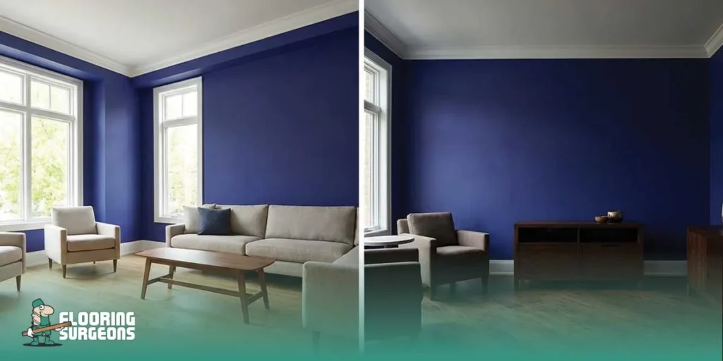
Light Wood Flooring with Indigo Walls
Light wood flooring with indigo walls creates upward contrast that keeps the space open. Pale oak, natural ash, or soft neutral tones counterbalance the depth of deep blue walls and reduce visual weight at floor level. This combination often produces the most stable light vs dark flooring contrast because the brightness below prevents the room from feeling enclosed. Indigo tends to feel most balanced with lighter and mid-tone timber bases, so browsing engineered wood flooring options can help you visualise the right undertone before committing to paint. Light flooring also enhances perceived ceiling height when indigo is used generously. By reflecting more ambient light, it softens shadow buildup and maintains visual balance across the room.
Dark Flooring Under Bold Indigo
Dark flooring under bold indigo requires careful proportion control. When both vertical and horizontal surfaces are deep in tone, visual compression increases, especially in smaller rooms. The space can feel grounded and dramatic, but it risks becoming dense if natural light is limited. To avoid imbalance, dark floors work best when white elements are stronger, and ceilings remain noticeably lighter. The contrast must be layered rather than stacked, ensuring the room reads structured rather than heavy.
White Walls and Warm Wood Balance
When indigo is limited to accents and white dominates, warm wood flooring introduces stability. Warm undertones prevent calming white interiors from feeling sterile and create smoother transitions between light and dark surfaces. This pairing demonstrates how flooring and wall colour coordination shape the atmosphere. Even subtle shifts in wood tone can change how bold indigo accents are perceived, either amplifying contrast or softening it into a cohesive palette. Even a small shift from a cool-toned engineered wood to a warmer light oak can noticeably soften how bold blue wall ideas are perceived in open-plan layouts.
Floor Finish and Reflectivity
Beyond colour, floor reflectivity impact plays a measurable role in how indigo and white feel. Satin or low-sheen finishes gently redistribute light, helping to soften high-contrast interiors. Highly matte dark floors can absorb too much light in already shadowed spaces, increasing the sense of enclosure. Gloss levels, therefore, influence perception as much as paint choice. Managing sheen, tone, and contrast together ensures indigo remains refined rather than overpowering. Finish selection also changes perception more than expected, as lacquered surfaces reflect light differently compared to oiled finishes, subtly altering contrast throughout the day.
Common Mistakes When Using Indigo and White
- Pairing a dark floor with dark indigo walls in small rooms increases visual compression and creates one of the most common dark wall mistakes.
- Using pure cool white with cool indigo results in a sterile contrast imbalance instead of refined depth.
- Ignoring flooring tone when selecting paint, leading to disjointed transitions and preventable small room colour errors.
- Choosing high gloss floors that amplify shadows from deep blue walls and intensify contrast unnecessarily.
- Installing thick, sharply contrasting skirting boards that create strong horizontal breaks and reduce perceived wall height.

Is Indigo a Short-Term Trend or a Long-Term Design Choice?
While indigo is prominent in the indigo colour trend 2026, its foundation lies in timeless navy tones that have been used in interiors for decades. Deep blue carries a level of stability that often outlives seasonal palettes. From a resale perspective, indigo used thoughtfully can read as sophisticated rather than risky, especially when balanced with adaptable materials.
Its longevity also depends on flooring compatibility. Indigo pairs well with engineered wood, light oak tones, and even high-quality luxury vinyl in natural finishes. Because it works across multiple flooring types and wood undertones, indigo has the flexibility to evolve with changing décor rather than locking a room into a short-lived aesthetic.
If You Want to Use Bold Indigo Safely, Follow These 5 Rules
- Balance dark walls with lighter or mid-tone flooring to reduce visual weight.
- Avoid extreme cool contrast between indigo and bright white surfaces.
- Test paint samples next to your flooring before finalising the palette.
- Keep the ceiling noticeably brighter than the indigo walls to maintain vertical openness.
- Limit high-gloss surfaces that may exaggerate shadow and contrast.


