Orange and blue can be a striking colour combination in interior design, but it only works when there is a clear hierarchy. One colour needs to lead, while the other plays a supporting role. Without that balance, the space quickly feels loud or visually unstable. This is where flooring becomes critical. The right flooring choice acts as a neutral anchor, grounding the contrast and allowing orange and blue elements to coexist without competing.
In well-designed interiors, flooring does not fight bold colours. Instead, it softens transitions, controls visual energy, and keeps the room feeling intentional rather than chaotic. The sections below explore how to use orange and blue decor in a controlled, sophisticated way, and which flooring choices help create a balanced, comfortable result rather than an overwhelming one.
Table of contents
Why Orange and Blue Work Together in Interior Design
Orange and blue work together because they sit on opposite sides of the colour spectrum, creating a natural warm–cool balance. Orange brings warmth, energy, and visual stimulation, while blue introduces calm, stability, and control. In orange and blue interior design, this contrast is what makes the combination feel dynamic rather than flat. However, that same contrast is also what makes it risky. When both colours are used with equal intensity or without a clear hierarchy, the space can feel visually loud and uncomfortable. This is why successful orange and blue decor ideas rarely treat the colours as equals. One colour typically dominates, while the other appears in smaller, supporting doses.
From a psychological perspective, orange is associated with creativity, warmth, and social energy, but too much of it can feel overwhelming or restless. Blue, on the other hand, is linked to calmness, focus, and emotional balance, but overuse can make a space feel cold or distant. Complementary colour interiors work best when these psychological effects are carefully balanced, allowing energy and calm to coexist rather than compete.
This is also why neutral elements—especially flooring—play such an important role in orange and blue spaces. Flooring helps regulate contrast, soften transitions between colours, and prevent the palette from tipping too far toward stimulation or coldness. When the foundation is calm and neutral, orange and blue can feel intentional, modern, and visually comfortable rather than chaotic.
How to Balance Orange and Blue Without Overwhelming the Room
Balancing orange and blue successfully comes down to control, not contrast. The most common mistake in orange and blue home decor is using both colours at full strength, in equal amounts, and across too many surfaces. This approach overwhelms the room and makes the palette feel chaotic rather than intentional.
The safest and most effective method is to choose a dominant colour and treat the other as an accent. In most interiors, blue works better as the dominant base because it naturally recedes visually and creates calm. Orange, by contrast, is visually assertive and should be used in smaller, deliberate doses. This hierarchy is what creates a stable orange blue colour balance rather than visual competition.
Proportion and placement matter as much as colour choice. Large surfaces—such as floors, walls, or large furniture pieces—should stay neutral or lean toward the dominant colour. Accent colour works best on elements that can be visually “edited” later, such as cushions, artwork, throws, or decorative accessories. This approach allows you to use bold colours in interiors without committing them to permanent features that are hard to change.
Tone also plays a critical role. Orange rarely needs to be bright to be effective. Muted terracotta, burnt orange, or soft clay tones deliver warmth without shouting. Similarly, blue doesn’t need to be deep navy to ground a space. Soft slate, dusty blue, or greyed blue shades maintain calm while still providing contrast. When both colours are softened slightly, the room feels layered and refined instead of loud.
Ultimately, successful balance comes from restraint. Orange and blue work best when they are never fighting for attention. One leads, one supports, and neutral elements—especially flooring—hold everything together.
The Role of Flooring in Orange and Blue Interiors
In orange and blue interiors, flooring plays a stabilising role rather than a decorative one. Because the colour palette already creates strong contrast, the floor should calm the space instead of competing with walls, furniture, or accessories. The most successful flooring for orange and blue decor acts as a visual anchor that keeps the room feeling balanced and intentional.
This is why bold colours and busy floor patterns rarely work well together. When flooring tries to make a statement of its own, it amplifies contrast and increases visual noise. The best flooring for bold interiors prioritises subtle texture, consistent tone, and low visual movement, allowing orange and blue elements to stand out without overwhelming the room.
Undertone is just as important as colour. Flooring with neutral or slightly warm undertones helps regulate flooring colour balance, preventing the palette from feeling too cold or overly intense. When the floor is visually quiet, the overall design feels more controlled, comfortable, and easier to live with. Many homeowners choose luxury vinyl flooring because it offers calm, consistent tones that balance bold colour palettes without adding visual noise.
Best Flooring Choices for Orange and Blue Decor
When working with a bold colour combination like orange and blue, flooring should calm contrast rather than add to it. The most effective floors are visually quiet, consistent in tone, and free from strong patterns. Whether you choose wood, wood-look, or neutral surfaces, the goal is the same: allow colour to lead while flooring provides balance.
Pattern-heavy floors often fail in colourful rooms because they introduce a third competing element. Instead, the best flooring for orange and blue interiors supports the palette subtly, keeping the space cohesive and easy to live with.
Light Wood Flooring for Soft Contrast
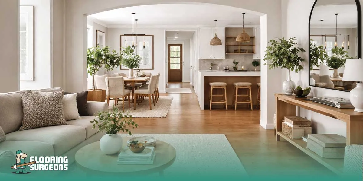
Light wood flooring creates a gentle backdrop that prevents orange and blue decor from feeling overpowering. Tones like light oak or neutral blonde woods reflect light well and reduce visual weight, making them ideal for bedrooms and living rooms. In a light wood flooring interior, colour accents feel more intentional and less aggressive. Oak flooring with blue decor, in particular, works well when orange is used sparingly through accessories or soft furnishings, creating warmth without visual overload.
Mid-Tone Wood Flooring for Depth and Warmth
Mid-tone wood flooring offers more depth while still maintaining balance. These tones introduce warmth without becoming dominant, making them well suited to muted or earthy orange shades paired with softer blues. A warm wood flooring interior works especially well in hotel-style and modern spaces, where colour is controlled and layered rather than bold and saturated. The key is avoiding strong grain contrast, which can distract from the colour scheme.
When Neutral Flooring Works Better Than Wood
In some interiors, wood can add too much warmth, especially when orange is already a dominant colour. In these cases, neutral flooring options such as stone-look finishes, soft greys, or low-texture surfaces work better. Neutral flooring interiors help regulate contrast and are particularly effective in contemporary or minimalist spaces. Grey flooring with orange and blue creates a clean, controlled base that keeps the palette modern rather than busy.
Rooms Where Orange and Blue Work Best
Orange and blue can work beautifully in interiors, but only in the right rooms and with controlled use. This colour pairing is most successful where contrast adds energy without disrupting comfort or focus.
Living Rooms
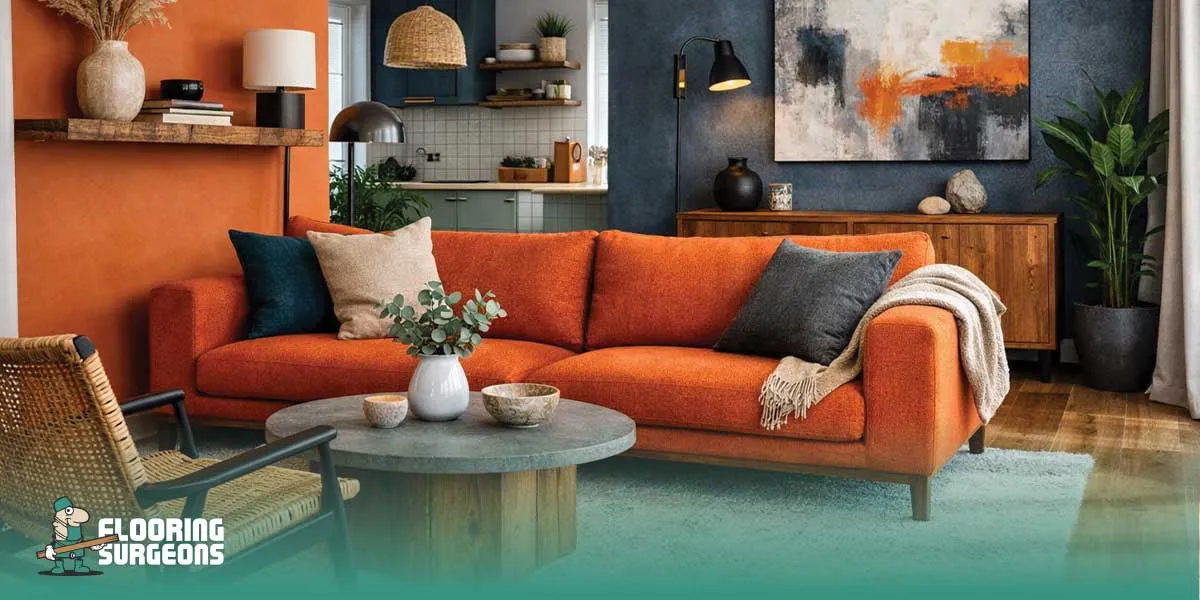
The orange and blue living room is where this combination feels most natural. Blue provides calm and structure, while orange adds warmth and personality. Living rooms can handle stronger contrast because they are social spaces, not purely restorative ones. Using blue as the dominant colour and orange as an accent through cushions, artwork, or décor keeps the space balanced rather than overwhelming.
Bedrooms (With Restraint)
Orange-blue bedroom decor requires far more control. Bedrooms should feel calm first, expressive second. In most cases, blue should lead through walls, bedding, or flooring tones, while orange is introduced subtly through soft furnishings or small details. Overusing orange in bedrooms can disrupt the sense of rest, which is why restraint is essential. This restrained approach is commonly seen in luxury hotel-style bedrooms, where colour is layered carefully to support rest rather than visual impact.
Home Offices
Home offices benefit from the psychological balance of this pairing. Blue supports focus and clarity, while orange adds energy and motivation. When used carefully, orange and blue create a workspace that feels alert but not stressful. Keeping flooring and large surfaces neutral helps maintain visual control and prevents distraction.
Common Mistakes to Avoid with Orange and Blue Decor
Orange and blue interiors fail far more often due to execution, not colour choice. These are the most common orange and blue decor mistakes that turn a bold palette into a visually exhausting space.
Using Too Much Saturation at Once
Highly saturated orange and deep blue used together across large surfaces quickly overwhelm a room. This is one of the most frequent bold colour interior mistakes. When both colours are intense, neither has space to breathe, and the room feels loud rather than designed. One colour should always be softened, muted, or limited to accents.
Letting Flooring Compete with the Colour Scheme
Pattern-heavy or high-contrast flooring is a common mistake in orange and blue interiors. Floors that have strong grain variation, busy patterns, or bold colour shifts compete with the wall and décor palette instead of grounding it. Flooring should stabilise the scheme, not fight for attention.
Overusing Dark Tones
Dark blue paired with burnt or deep orange can make a space feel heavy, especially in rooms with limited natural light. When both colours lean dark, the room loses visual openness and balance. This is particularly problematic in bedrooms and smaller living spaces, where calm and lightness matter most. Avoiding these mistakes allows orange and blue to feel intentional, balanced, and modern rather than chaotic or dated.
At Flooring Surgeons, we often see that successful colour-led interiors start with flooring choices that support balance, not trend-driven statements.


