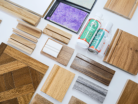
Picking colours for a room sounds easy until you actually try it. That shade you loved in the store? It looks totally different next to your couch, or when the afternoon sun hits it. It’s enough to make anyone second-guess their choices.
So, here’s the deal: these are the colour rules to follow, according to the interior designer. No fluff, just real advice you can use. The whole point is to help you pull a room together so it feels like everything belongs, not a bunch of random stuff thrown together. Not sure where to start with your walls, floors, or which colours even go together? Don’t worry. This guide breaks it all down, step by step, so you can pick your palette with confidence before you lift a single paintbrush.
Table of contents
Rule 1: Start With the Room Mood Before Choosing Colours
People often pick out paint colours before they’ve even thought about how they want the room to feel. Sure, a colour might look amazing on one of those little sample cards, but once it’s up on your walls next to your floors and furniture, it can feel completely off. Interior designers know this, so they always start by thinking about the mood. Do you want the space to feel calm? Or maybe you’re after something warm, bright, or bold? Figure that out first.
Once you have the mood in mind, picking colours suddenly makes a lot more sense, and the whole room ends up feeling more put-together. It’s a simple trick, but honestly, it saves you from making expensive mistakes and makes choosing your colour scheme way easier.
Rule 2: Use the 60-30-10 Colour Rule for a Balanced Room
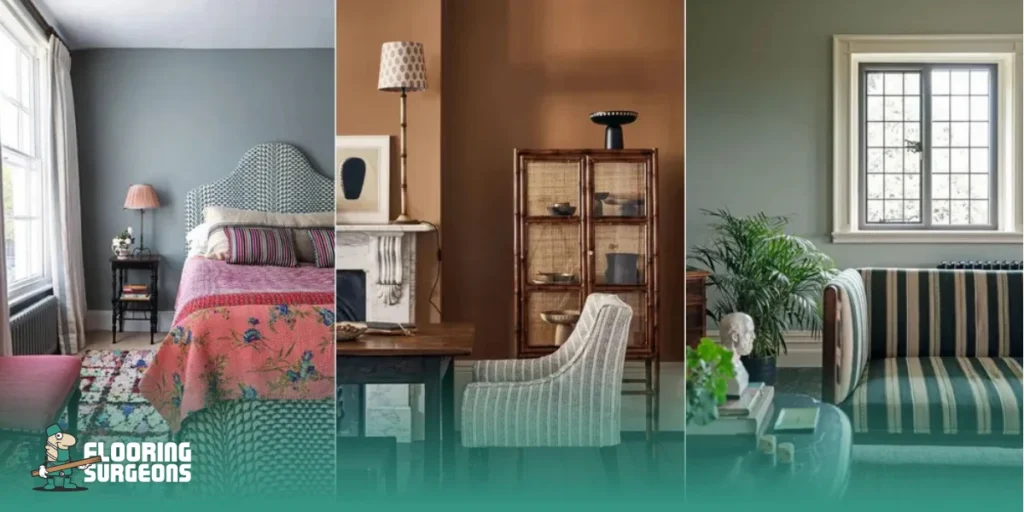
If you want a room that feels balanced, stick to the 60-30-10 colour rule. Designers lean on this trick all the time to keep spaces from looking dull or overwhelming.
Here’s how it works. Pick one main colour and let it cover about 60% of the room, usually that’s your walls or the background stuff. Then, choose a secondary colour for around 30% think bigger pieces like your sofa, rugs, or curtains. Finally, use a bold accent colour for the last 10%.
That’s where you bring in a few eye-catching touches: pillows, art, maybe a vase or two. This rule keeps things organised without making your room feel stiff or over-planned. It’s a simple way to make sense of all the colours, floors, walls, and décor, so everything comes together without the guesswork.
Quick Guide to the 60-30-10 Colour Rule
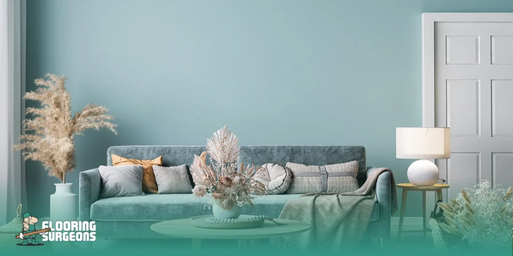
Here’s a simple way to use the 60-30-10 colour rule. Think of it as a shortcut for spreading colour around your space so your walls, floors, furniture, and little accents actually work together, not just float around randomly.
| Colour role | Share | Best used for | What this usually includes | Example |
| Dominant colour | 60% | The main backdrop of the room | Walls, large surfaces, overall visual tone | Soft white, warm beige, light greige |
| Secondary colour | 30% | The supporting colour that adds structure | Flooring, sofa, curtains, larger furniture pieces | Grey laminate flooring, oak floor tone, mid-tone sofa |
| Accent colour | 10% | Contrast and personality | Cushions, artwork, lamps, decor accessories | Navy, olive green, terracotta, black accents |
Rule 3: Build a Neutral Colour Palette With Depth
Neutrals are a solid starting point, but you don’t want the room to end up looking flat or lifeless. The trick? Mix things up a bit. Play with different tones, textures, and finishes to make the space feel layered and interesting.
Pick a neutral direction that fits the vibe you want: go for warm neutrals if you’re after a soft, cosy mood, or cooler ones if you like things crisp and fresh. Don’t forget to see how that neutral looks next to your floor in real daylight, not just under lamp light. Floors have a sneaky way of changing how your wall colour looks, and honestly, most people overlook that.
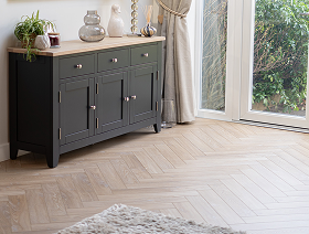
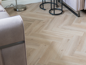
Want a brighter, more open feel? Light laminate flooring works with soft whites, greige, and muted shades. It keeps things clean and airy without leaving the room looking cold or stark.

Rule 4: Balance Warm and Cool Tones in Your Colour Scheme
Mixing warm and cool tones without thinking it through can throw off a room’s vibe. Sure, the colours might look fine by themselves, but when the undertones don’t match up, something just feels off. Designers usually see the space as a single, unified colour palette. They pay close attention to the flooring, walls, and main pieces of furniture. Warm tones play well with other warm shades, and cool tones are easier to match with other cool shades.
Here’s a quick trick: Line up your wall colour, floor, and furniture and check how they look together before you commit. If you want a deeper dive, take a look at our blog: How to Match Flooring Colours with Wall Colours and Furniture.
Rule 5: Test Colours in Natural Light Before Making a Decision
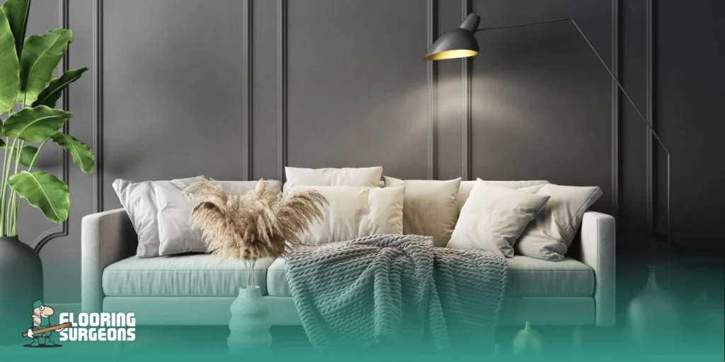
Colours can surprise you once they’re up on the wall, especially next to your flooring. That’s why you really need to test them first. Light shifts all day long; a shade that looks perfect in the morning can turn chilly, dark, or just flat by evening. So, before you settle on anything, paint some samples right on your wall. Check them out in the morning, afternoon, and at night. You’ll get a feel for how everything works together in your actual space, not just on a tiny paint chip.
The same goes for your floor. Picking the right floor colour makes a big difference to a room’s overall vibe. Need help figuring that out? Take a look at our blog: Tips to Choose the Right Colour for Flooring.
Rule 6: Choose Colours by Room Function, Not Trends
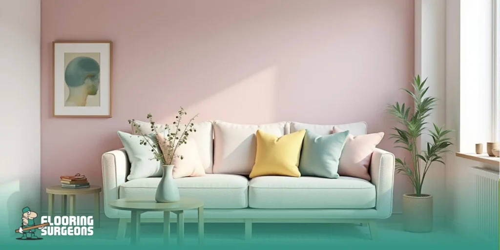
Trends can spark ideas, sure, but don’t let them call all the shots. Think about how you actually live in space, how it needs to feel and work for you every day, not just how it looks in a magazine. Designers always start with the room’s purpose. Take living rooms, for example. You want them to feel comfortable and flexible, right? That’s why neutrals and gentle contrasts usually create the right vibe.
Kitchens and bathrooms are a bit different. Here, you have to balance style with practicality. Colour still plays a part, but you also need to consider factors like moisture, cleaning, and how everything will hold up over time. That’s where smart finishes come in handy. Luxury Vinyl Flooring gets a lot of love because it lets you play with colour without sacrificing durability or making life harder. It just works for busy, real-life spaces.
Common Colour Mistakes Interior Designers Avoid
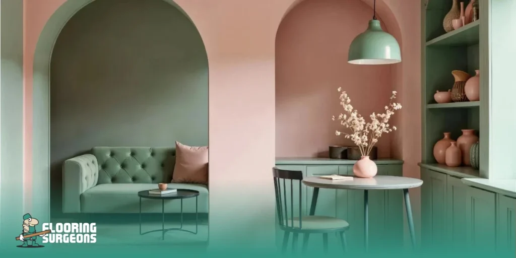
Even the best colour ideas fall flat if you miss the basics. A lot of mistakes come from picking colours one by one rather than treating the whole room as a single palette. Stick to some core colour rules, and you’ll dodge expensive blunders. Following a few core interior design colour rules helps you avoid expensive mistakes and create a more balanced result.
- Ignoring colour undertones in your flooring, walls, or furniture, those sneaky hints of yellow, red, or blue can throw everything off.
- Choosing paint just from a photo, without seeing how it actually looks in the real light of your space.
- Skipping test paint samples and diving straight into the final colour is a big risk, big regrets.
- Chasing trendy colours that don’t fit how you use the room.
- Using too many similar shades leaves the space looking flat and lifeless.
- Forgetting to consider how your wall colour and flooring work together when you’re building your palette.
Get these basics right, and you’re already ahead of the game.

Final Thoughts: Use Colour Rules, Then Personalise Your Space
Here’s the thing about picking colours: it’s not about chasing trends or following a bunch of rules. It’s about making your space feel just right for you, balanced, comfortable, and actually livable. Start by thinking about the mood you want, pick a palette that makes sense, and always see how colours look in real light. That’s when everything just clicks into place.
If you’re about to refresh a room, Flooring Surgeons can help you find floors that fit your colours and your lifestyle. They know how to make it all work together.

Ana.Soltanpoor
I’m an SEO Specialist with a strong background in content management and organic search. I build data-driven content strategies by aligning user intent, search behavior, and SEO best practices to ensure every piece of content delivers clarity, relevance, and measurable organic performance.